Enhanced Smart Images, Notifications, and Others
The following describe new features and changes related to the user interface and end user experience:
Smart image uploading and rendering
The smart image feature provides automatic resizing of images:
- Specify a maximum size in Image Upload field properties, to have Platform automatically resize images when users upload them.
- Enable a dynamic image preference that causes Platform to automatically store images that are 992px or wider in four pre-defined widths (992px, 768px, 480px, and 50px) and to render the appropriate image. For example, on record list pages, Platform uses the smallest image, but for view pages and pages that display cards, Platform uses the image closest to but smaller than the device. The dynamic image preference applies to all apps in a tenant. Images narrrower than one or more of the pre-defined widths will be stored in the original size and the narrower widths. For example, an image with a width of 500px would be stored at 500, 480, and 50.
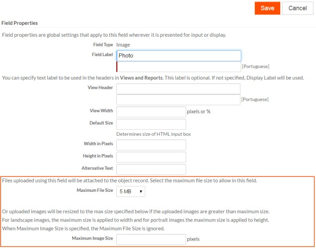
To have Platform automatically resize images on upload, use the new Image Upload field property Maximum Image Size and specify a value in pixels. For landscape images, Platform applies the maximum size to the width. For portrait images, Platform applies the maximum size to the height. When Maximum Image Size is specified, Platform ignores the Maximum File Size property. Platform resizes images only if they are larger than the specified value.
Click the thumbnail to see the location of these two settings on the Field Properties screen.
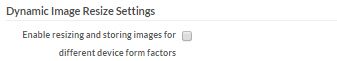
To set the dynamic images preference:
- From the Setup home screen, click Preferences under Administration Setup.
- In the Dynamic Image Resize Settings area, select the Enable resizing and storing images for different device form factors check box and save your changes.
Support for simplifying import procedure
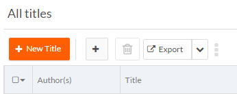
This release allows you to simplify the end user procedure for importing data from spreadsheets or CSV files to create records. You can create an import map and a custom way to invoke import, such as a button, link, or trigger that passes in the map id. Then, users do not need to select the import action (create new record) or the import map, they can simply select the file. To avoid confusion between the simplified import and the default import, you can label your button or link explicitly and/or you can hide the default import button and menu item.
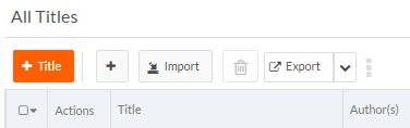
For example, the following screen shows a simplified import button as part of the new record page toolbar.
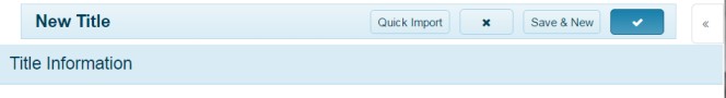

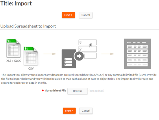
When end users click the button, a streamlined Import page opens where the user selects a file and clicks Next to begin the import.
Note: If users need to update or delete records from spreadsheets or CSV files, they will need to use the default import procedure that is initiated from the Import button or menu item on record list pages. If you do not need to support update and delete in this way, you can hide these items as follows:
- To hide the Import button, open the record list page in the page editor and deselect the property Show Import Link from the record list component.
- To hide the Import menu item, deselect View permission for the object's Menu: Import for any role for which you want it hidden.
High level steps for simplifying the import procedure
To enable a simplified import procedure, follow these high level steps:
- Create the import map to specify the mappings between an object and the import source.
- Using a mechanism that supports a URL, such as a button, trigger, or link,
construct a URL to open the object's Import page and pass in the import map ID. Use the following
parameters of the
rb.newui.util.addQueryParameter()method to supply the required information for the URL:importMode— An integer representing the import mode. Currently, the only valid value is0, which creates new records.destId— The ID of the current page (available from thePageContextobject as shown below)oMapId— The original ID of the import map to use to import data
Example for creating a simplified import button
To create a simplified import flow similar to the one shown in the screen shots above, after you have created an import map and have saved its ID, follow these steps:
- Open the object definition.
The example demonstrates simplified import for the Title object.
- Jump to the Buttons section and click New
Button
The New Button screen opens.
- Set the fields as follows:
- Enter a Display Name
- Leave the default Behavior set as: Run client-side JavaScript.
- From the Template Helper in the
Button Script editor, in the field right of
the object name, select the URL to Import
Page.
The token shows in the field at the bottom of the Template Helper, for example for the Title object.
- Copy the token to use in the script.
- In the script area of the editor, construct a URL and add the logic to
open the Import page with the
rb.newui.util.addQueryParmeter()method.The following shows the example code for the Title object with a map ID of SIi4gXEIR5OeNvwwK6NeFA. The JavaScript formula for the button adds these parameters to the Import page URL and sets the JavaScript
window.locationobject to redirect the user to that URL:var url = '{!#LINK.Title#import}'; url = rb.newui.util.addQueryParameter(url, 'importMode', '0'); url = rb.newui.util.addQueryParameter(url, 'destId', rbf_getPageContext().getPageId()); url = rb.newui.util.addQueryParameter(url, 'oMapId', 'SIi4gXEIR5OeNvwwK6NeFA'); window.location.href = url;
- Select the pages on which you want the button to appear.
- Save the button.
Ability to position notification messages
For apps that use the New UI, you can now choose where to position notification messages: the default upper right corner or the lower right corner.
Set notification message position as follows:
- Navigate to the application settings page.
- Click Edit to edit application properties.
- Scroll to the New UI Specific Settings section.
- From the Notification Position drop-down, select the position for notifications:
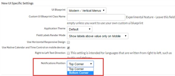
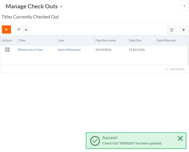
Selecting the option Bottom Corner positions notifications for that application as shown below.
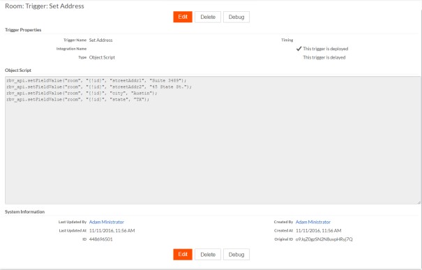
Trigger screen improvements
The following trigger screens have been redesigned for better usability and organization:
- The New Trigger screen consumes the
available space correctly, sizes the columns appropriately (in particular, when
the language is not English as shown below), and avoids rows that are too tall.
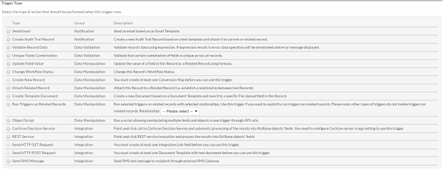
- The trigger create and edit screens now present the type and
name of the trigger first, and all trigger timing-related fields are grouped
together as shown below.

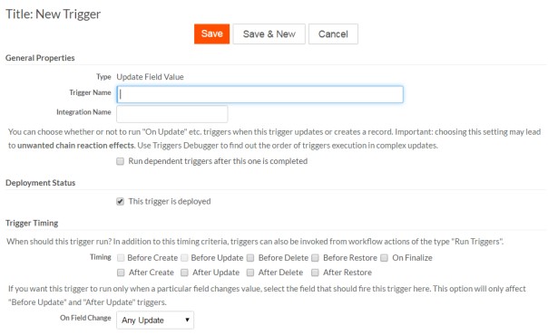
- The trigger view page uses screen space more efficiently, and for
Object Script triggers, provides
more space for the Object Script editor.
The system information and the second toolbar at the bottom of the screen. The
following shows the new trigger view layout:

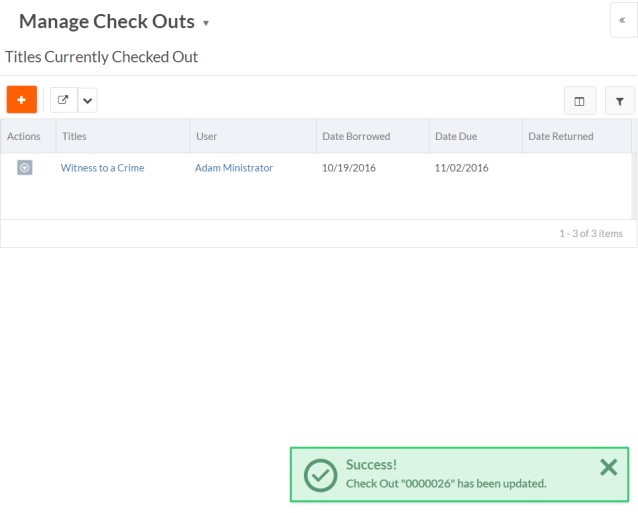
Text change for new record button on record List pages
Previously, the new record button on record List pages included the word New. This caused an issue for multilingual applications since "new" can be translated in different ways in some languages. Now, the button simply shows the plus symbol and the object name.
The old button looks like this:
The new button looks like this: